Our Kitchen Reveal…Finally!
Last fall we finished up our phase 1 renovation at the KDClassicComfortRanch and I promised myself it wouldn’t take me a year to get this post written and posted! I met my goal by a month or so, so that’s a win! Living through what feels like an on going renovation, raising three kids, running a business and just living life, makes tackling tasks like these a little challenging. But the time is finally here to share this labor of love with you all!
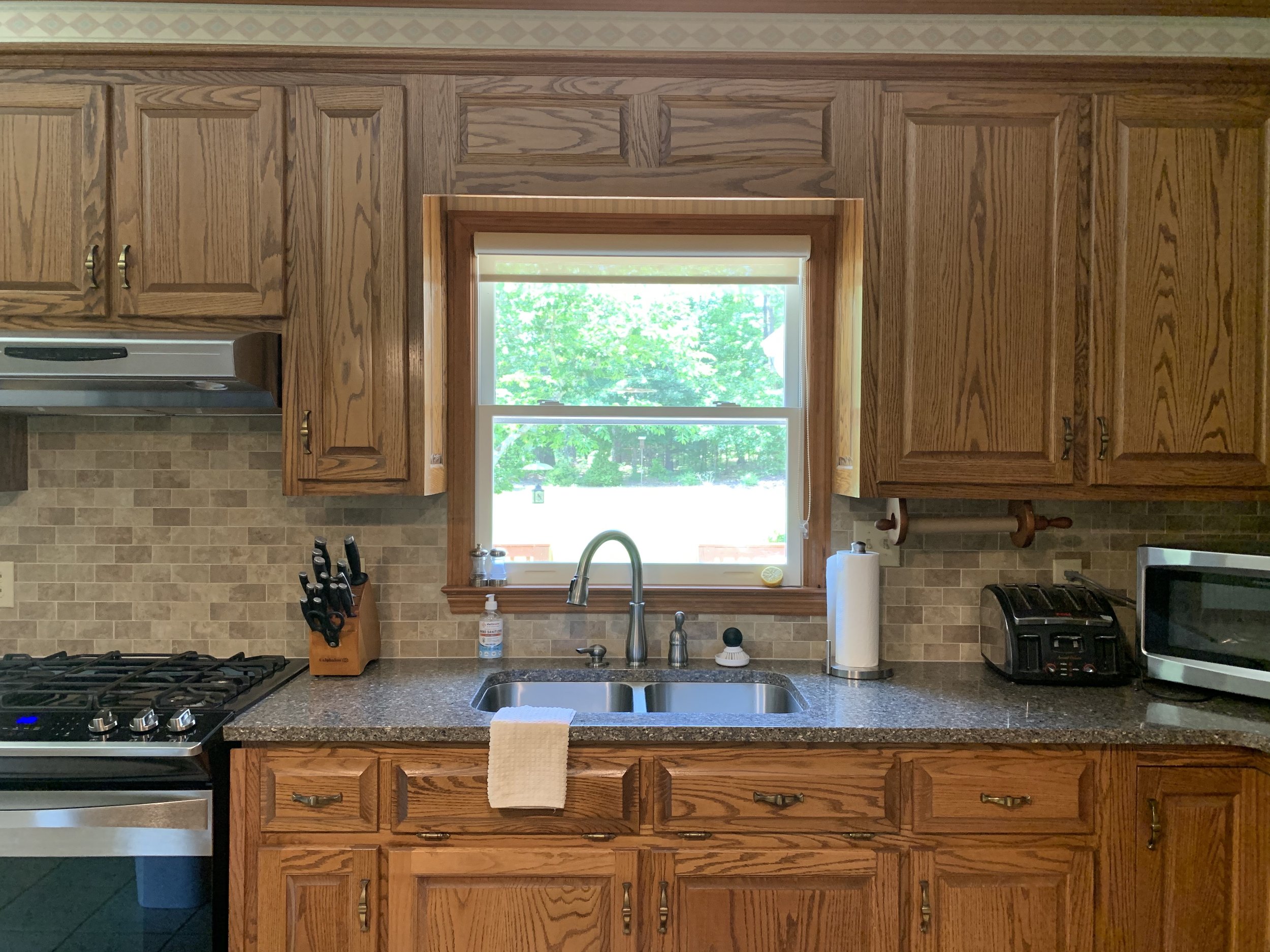
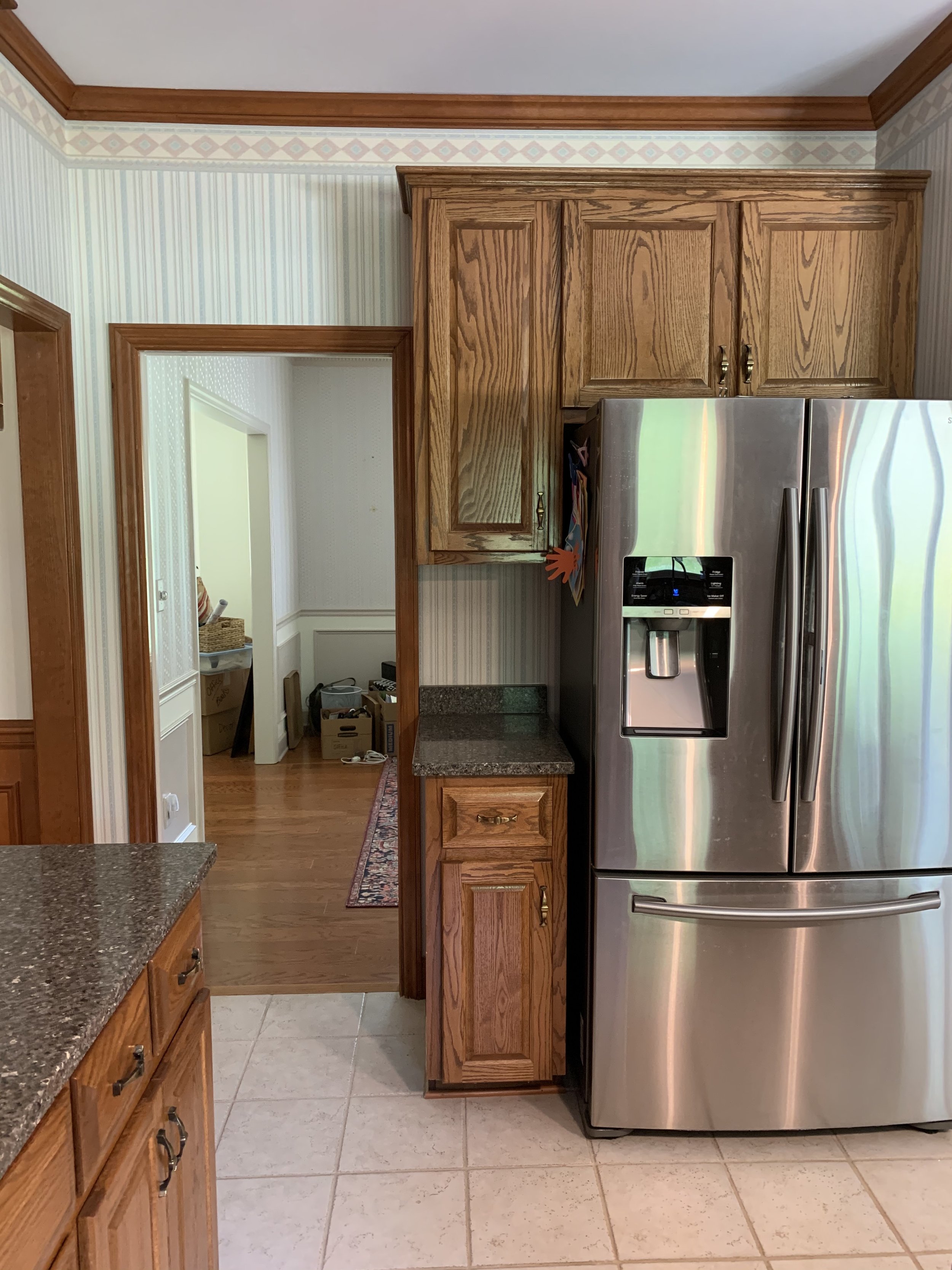
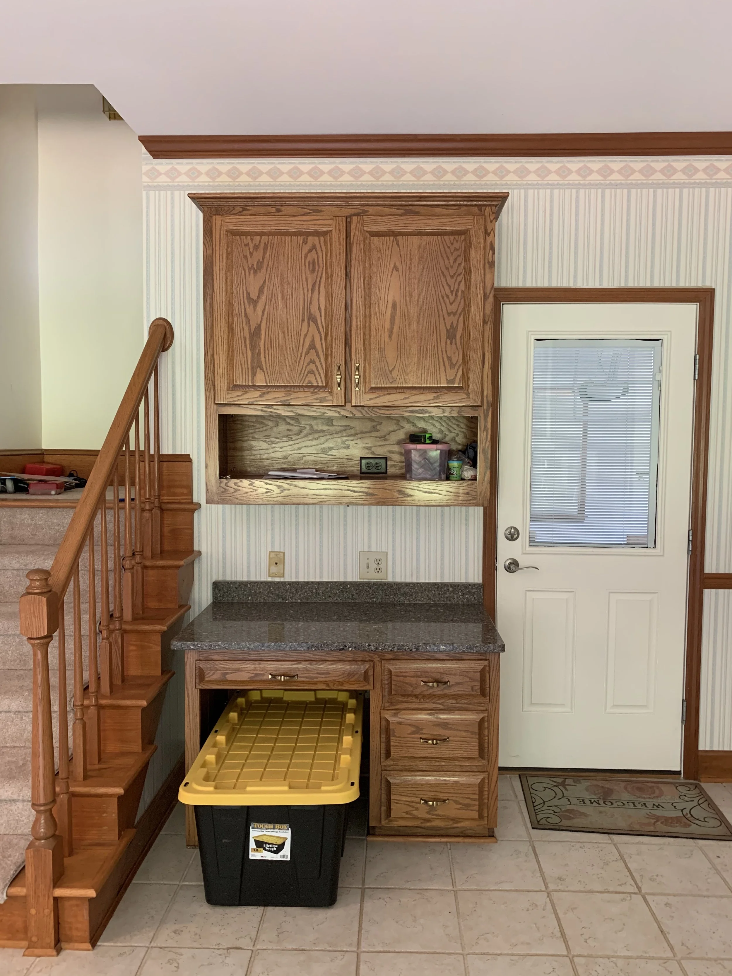
When we bought this home it really was stuck in the 90s but the bones were so good!(Cue Maren Morris) There was oak stained cabinetry, a breakfast bar cut-out, wallpaper and the coveted kitchen desk of the 90s! But all I could see was the square footage of this kitchen! There was an entire dance floor of open space between the breakfast area and stairs that came down into the kitchen. I knew I had a lot to work with! So the planning, measuring and rendering began and I came up with a design that feels like it had been there all along. That is always the goal in my renovation designs, for people to walk in and immediately feel like everything is right where it has been all along.
When I made the decisions on the cabinetry style and design I knew I wanted to stay true to the traditional style of the home but with a few elevated moments thrown in. By mixing the drawer profiles with a more simple slab front top drawer and a traditional rail on the lower drawers I was able to blend these two styles to make these cabinets feel very custom. It also gives an elegant feel without overpowering the room with ornate features. I also chose to bring the base around the bottom of the cabinets instead of the typical toe kick below the cabinets. I like the way this grounds the cabinets and dresses them up a little. All of these choices made a huge difference in the complete look of the room bringing in an easy, yet elegant design.
Even though we didn’t have to change or move any exterior walls in this design, one of the biggest changes we made was putting in the massive 10’ window above the sink. This decision was made with potential future plans in mind. We have talked about possibly adding on to the back of the kitchen where the breakfast windows are across to the outside corner of the house. If we ever did that, we would have lost all of those big windows and only been left with a small 3’ window over the sink. Which WOULD NOT WORK! We spend so much time in this space, I knew that would not be enough natural light down the road. So we added this massive window over the sink and opted out of more upper cabinets. I figure, if we decide not to add on, we just have extra natural light! And who doesn’t want that!? Another feature on this wall is the drip edge added under the apron front sink. I designed this with our cabinet company as the resolution to a problem I have run into in past projects. When you have an apron front sink, the water rolls down the front of the sink and finds it’s final resting place right on top of your cabinet doors. Which over time, causes the paint to flake off. So this drip edge has a routed-out groove on the underneath side. This allows the water to roll over the cling to that groove and drip straight to the ground, instead of on your cabinetry. Now this isn’t as much of an issue with inset cabinet doors, but it’s still added protection. These can be made of wood or countertop material.
I decided to use the space where the stairs originally came down into the kitchen for more cabinetry and moving the stairs allowed us to extend the island much further into the kitchen and add seating. On this wall we added two small under cabinet appliances, an ice maker and a beverage fridge, along with the full-size refrigerator and pantry flanked on either side. By doing this we were able to incorporate all the square footage as kitchen space and nothing is wasted! We did even out the far wall of the kitchen where the wine rack cabinets used to be, this allowed us to add the entry from the garage into a mud room/hallway and not directly into the kitchen. Another huge space saver as well as added functionality!
Now to talk about my favorite feature! the range wall!! I knew I wanted a large hood to stand alone as a statement piece. This is the first thing you see when you walk into the kitchen so it had to be a show stopper! I added a soft arch in the front of the hood to counter all the angles. This radius was also repeated on the seating end of the island. The shape of the room and all the windows made everything feel very angular so these softer edges help blend those out. Inside the legs of the hood, we have oak shelves for all of our seasonings and cooking supplies to be within reach. And the final feature of this wall are the copper pots and custom brass rail ❤️ . I found the Revere Ware pots on FBMarketplace for a STEAL before we ever bought this house! To be honest, they were a huge inspiration for this kitchen and how it was designed. So they needed to be showcased! Saint Udio in Athens, Ga custom turned this beautiful brass rail and hooks that just took it to the next level!
We couldn’t be happier with the way everything turned out in our kitchen! We feel thankful everyday to live in such a welcoming and beautiful space to call ours. Our first home we renovated paved an incredible path for us and our business and that is never lost on us. Let us know what you think and if you have any questions about more details, we would be happy to share!
Sources:
Cabinet Color // SW Oyster Bar
Island Color // Custom Stain
Floor Stain // Oyster by Rubio Monocoat on white oak


